Usability Evaluation
Introduction
Overview of WhimWe
WhimWe is the shortcut to fun. The goal is to provide socially-curated search results to help people find the right place that is specific to them, not the average person. WhimWe aims to dive into the niche world of individual's personalities and eliminate cognitive overload while curating the perfect experience for users. The 'Whim' represents speed, while the 'we' represents the community aspect.
Curent State
Most of the functionality is within the app, but the information architecture does not feel intuitive. The items within the app are not organized for high-use or low use functions. We need to establish cleaner key workflows or red routes to achieve desired goals.
Problems
- Many users of our mobile application are experiencing difficulties in navigating through the interface, resulting in frustration and decreased engagement. We need to identify the specific pain points and areas of confusion in the user experience to improve the app's usability and ensure a seamless and intuitive navigation flow.
- The absence of user research compounds the challenges faced by WhimWe, leading to a suboptimal user experience and decreased user engagement.
My Role
User Experience Researcher
One Month
Tools
Optimal Workshop
Survey Monkey
System Utility Scale
Figma
Miro
Methodology

Heuristic Evaluation
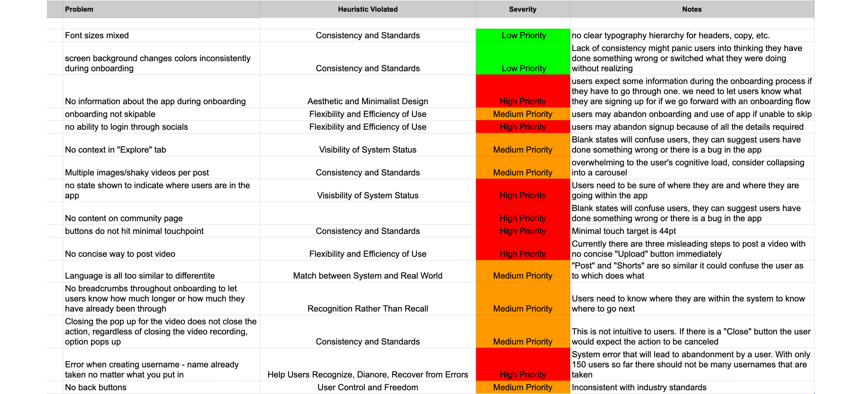
We decided to perform a heuristic evaluation as a cost-effective and time-efficient identification of usability issues. By assessing the app's interface against established usability principles, this evaluation method allowed myself and a fellow designer to uncover issues that might not be easily detected through other testing methods. Our team went through the app together and used an excel sheet to mark the level of severity of each violation and notes for the future of the app.
The most common heuristic violations were:
- Consistency and Standards
- Flexibility and Efficiency of Use
- User Control and Freedom
1. Usability Issues
The heuristic evaluation identified numerous usability issues within the latest version of WhimWe. This includes inconsistent font sizes, color schemes, lack of information and skip option during onboarding. These issues can frustrate users, lead to disorientation, and result in abandonment.
We recommend:
- Standardized font size
- Consistent color changes
- Providing some information during the onboarding process
- Providing an option to skip onboarding
2. Design and Interaction Challenges
WhimWe exhibited interaction challenges such as unclear context in the “Explore” tab, cluttered posts with shaky images as the users first experience, and a lack of clear indicator to show users their current state within the app. Insufficient error handling hindered the user experience upon sign up with a bug in the app causing it to crash when the user input a new username.
We recommend:
- Optimize touch targets
- Address blank states with helpful messaging
- Collapse ovewhelming information into a carousel format
- Differentiate language
Addressing these key points will contribute to a more user-friendly and intuitive app, increasing user satisfaction, engagement, and retention.
Sample of
Heuristic
Evaluation
User Interviews
User interviews are one of the most powerful research methods used in our field. We aimed to avoid leading questions and dig deeper into “why” with our users and avoid their own confirmation bias.
We were able to select a diverse group of users from ages 21-35 who primarily use social media to plan for their next activity, night out, or upcoming vacation.
We chose to run a Treejack survey to evaluate the information architecture of the app. Following the Treejack study, users were sent a followup SUS survey via Survey Monkey to gather user insights on how usable they felt the app might be.
Task Analysis
In collaboration with WhimWe stakeholders, we carefully identified two primary objectives that are the core of what WhimWe represents itself to be.
In order to gain valuable insights into the information architecture and navigation of the WhimWe platform, we conducted a Treejack study. This user-centered research method allowed us to assess the effectiveness and efficiency of the website's structure by evaluating how users would navigate through a simulated tree-like hierarchy. By analyzing participants' interactions and feedback, we were able to make informed decisions and optimizations to enhance the overall user experience on WhimWe. Following this TreeJack study, users also received a System Usability Survey (SUS) to gain an overall understanding of how they felt interacting with the product.
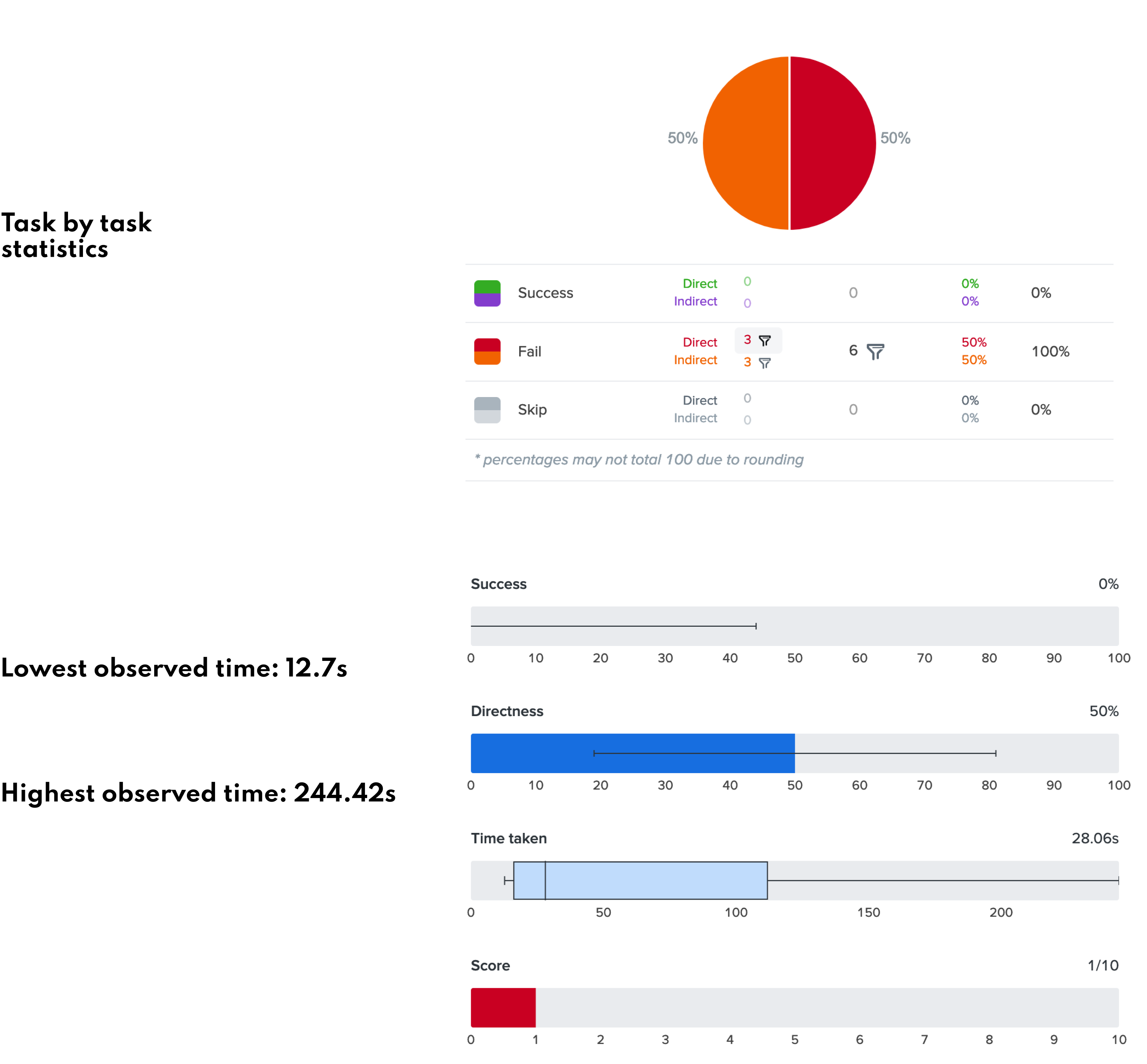
Task #1
1. Imagine you just landed on the homepage of the WhimWe app. You want to post your first video. Where would you go?


Insights
- Research suggests that users should ideally be able to make a decisions within 3 to 5 seconds when interacting with a mobile application. This timeframe aligns with the limited attention span and quick scanning behavior that is commonly observed in mobile users.
- The lowest observed time for task #1 for a user to make a decision was 12.7 seconds, leading us to conclude the app's current infrastructure is not intuitive.
- No users were able to accomplish their task successfully. All users failed directly or indirectly to post a video.
- Out of the initial 12 participants who began the study, 6 chose not to continue, indicating a potential risk of user abandonment if WhimWe requires significant effort to comprehend. This finding highlights the importance of ensuring a clear and intuitive user experience on WhimWe to minimize the likelihood of user abandonment.
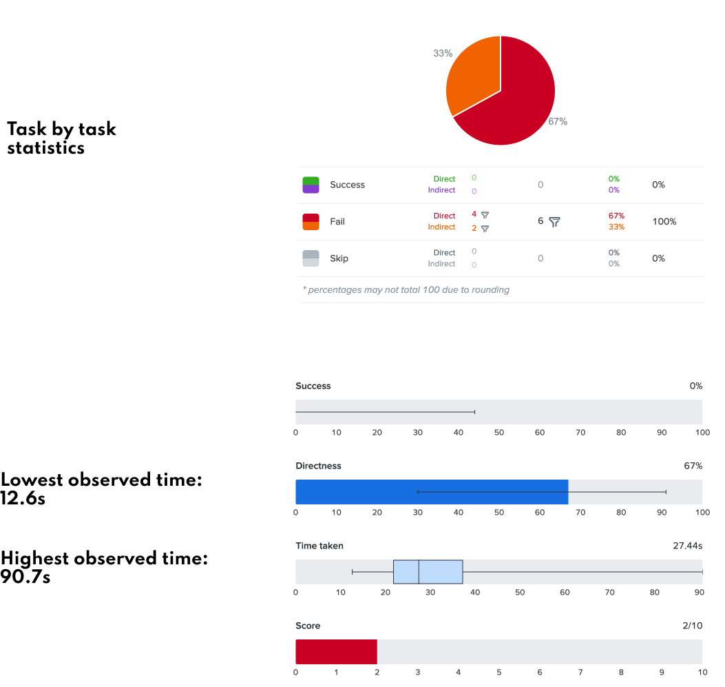
Task #2
2. Locate a stroller friendly community.


Insights
- The study identified four direct failures, indicating usability issues within the app. These failures highlight where the users encountered obstacles or difficulties while interacting with the application.
- The highest observed task time of 90.7 seconds suggest certain tasks within the app are time-consuming and may require excessive effort from users. This finding indicates a need to streamline and optimize these tasks to improve user satisfaction and efficiency.
- The study revealed the app is perceived as fairly unintuitive by users. This insight emphasizes the importance of enhancing the app’s overall usability, clarity, and learnability. Implementing intuitive design patterns, clear instructions, and visual cues can help users navigate the app more efficiently and reduce frustrations associated with its unintuitive nature.
SUS Scores
Sample from study

Average Score

- The average score for WhimWe was 43 based on 6 responses.
- The scores ranges from 25 to 48.
- The industry average score is 68
- Based on this data we would classify WhimWe as currently being unusable.
Personas
We created user personas based on data synthesis from our initial six user interviews. It's important to note that these personas do not represent the whole population's experience, simply those we talked to within the project's scope. In creating these personas, we hope to design for our users in our future iterations.
- Sochi the Consumer
- Sochi reprents the busy consumers who use the app for utility purposes
- Simply wants to find the right place, efficiently and without doubt
- Social Validation - considers the recommendations of friends reliable indicators of quality
- Values authentic user reviews
- Lily the Curator
- Lily is a food enthusiast who enjoys sharing her recommendations of high end events.
- Finds satisfaction in exchanging knowledge.
- Wants to build a following of high end followers and businesses
- Wants her influence to be valued by establishments
- Zander the Creator
- Max is a content creator focused on food and experiences
- Wants to become a prominent figure
- Aims to demonstrate his economic impact he brings to the places he visits
- Desires access to data on the number of people he drives to the places he recommends
Key Findings
1. Overall Usability
WhimWe received an average score of 43, significantly lower than the industry average of 68, indicating usability issues within the app. The study identified four direct failures where users encountered obstacles or difficulties while interacting with the application, highlighting areas that require improvement.
2. Task Efficiency
The highest observed task time of 90.7 seconds suggests that certain tasks within the app are time-consuming and require excessive effort from users. Streamlining and optimizing these tasks is essential to improve user satisfaction and efficiency.
3. User Engagement
Out of the initial 12 participants, 6 chose not to continue with the study, indicating a potential risk of user abandonment. This finding underscores the importance of ensuring a clear and engaging user experience on WhimWe to minimize the likelihood of user attrition.
4. Specific Interaction Challenges
The study revealed specific interaction challenges, such as unclear context in the "p;Explore"p; tab, cluttered posts with shaky images as the initial user experience, and a lack of clear indicators for users' current state within the app. Additionally, insufficient error handling during sign-up resulted in app crashes when entering a new username.
Recommendations
1. Optimize Touch Targets
- Improve touch target sizes to ensure ease of interaction and reduce accidental taps or selection errors.
2. Address Blank States with Helpful Messaging
- Provide informative and engaging content or instructions in areas with no or limited data to guide users and prevent confusion or frustration.
3. Collapse Overwhelming Information into Carousel Format
- Condense excessive information or content into a carousel format to improve readability and allow users to navigate through it more easily.
4. Differentiate Language
- Ensure clear and distinct language throughout the app, avoiding confusing or misleading terms or instructions.
5. Standardize Font Sizes
- Maintain consistent font sizes across the app to enhance readability and visual consistency.
6. Consistent Color Changes
- Establish a cohesive color scheme and ensure consistent color usage throughout the app for better visual harmony and user understanding.
7. Improve Onboarding Process
- Provide some information and a clear skip option during the onboarding process to guide new users effectively while allowing them to bypass it if desired.