The Project
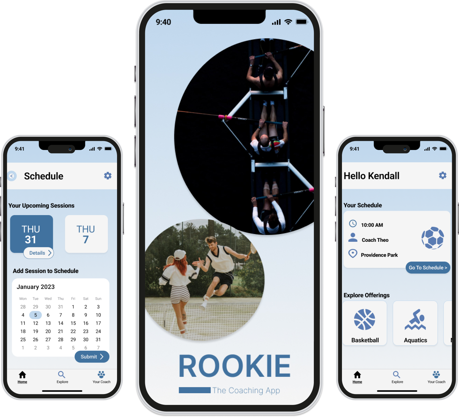
Welcome to Rookie, the ultimate app connecting aspiring learners with expert coaches to accelerate their development in a myriad of skills. Whether you're a novice looking to explore a new passion or a seasoned enthusiast aiming to reach new heights, Rookie provides a personalized learning experience tailored to your goals. With a vast roster of vetted and experienced coaches, Rookie ensures you find the perfect mentor to guide you on your journey. Unlock your potential, conquer new challenges, and embrace the joy of learning with Rookie—your gateway to expertise.
My Role
UX/UI Designer
Duration
3 Months
Tools
Figma | Usability Hub Optimal Sort | Google Forms
Overview
As we grow up, sometimes it can be challenging to try new things on your own. Barriers to entry could include lack of resources, fear of failure, not wanting to continue because you've had a bad experience with an instructor, the list can go on and on. Sometimes not knowing where to begin can be daunting, and questions begin to arise…
What if my instructor isn't a good fit for me? What if I'm not good after a few rounds of trying? How can I gauge the progress I am making? What if I can't afford to keep paying my coach?
The Problem
Users who are interested in trying new sports feel barriers to entry in their adult lives due to perceived athletic ability, financial constraints, or lack of time.
The Solution
A mobile application that gives users access to certified coaches from a variety of backgrounds while allowing for customizations that can be tailored towards users athletic, financial, and scheduling needs.
What is already out there?
The Competitive Analysis
To deepen my understanding of the overall market, I identified our competitors to gain a summary of strengths, weaknesses, and opportunities of the apps currently on the market.
Yelp

Strengths
- Established history of success and being a top search and review engine
- Functional and intuitive app and responsive web page
- Performance and reliability of its products and services differentiates itself from the established market players
Opportunitities
- Improved monetization strategy
- Lacks control over reviews and potential for “review bombing”
- Enhanced features to make the app more interactive
Task Rabbit
Strengths
- Safety is the priority, all “taskers” have background checks
- Straightforward sign up process
- Ikea takeover of taskrabbit has advertising in-store, increasing brand awareness while partnering with a trusted retailer such as Ikea.
Opportunitities
- Increase awareness of how TaskRabbit benefits both users and taskers on the app, the main focus is on users signing up.
- The platform does not require taskers to be professionals and does not check licenses
- Since moving away from a bidding system, there is no contact between the hired tasker and user before the services begin.
Goals for Rookie
- Encourgaging tone of voice to support advanced athletes and novices
- Consolidate the ability to schedule, pay, and chat with selected coach
- Flexible grace period for rescheduled or cancelled sessions
- Transparency with security including background checks of coaches on the app
User Research
Survey's & User Interviews
Research Goals
- To better understand user behavior on how users decide on a certain coach to train with.
- To determine which tasks users would like to complete using an app such as the Rookie mobile app.
- Uncover users thought processes and participation in their past private coaching experiences.
- Documenting user pain points with existing competitive analysis from competing apps.
- Collecting data on the context of use for users as it pertains to the Rookie mobile app.
Qualitative Analysis
Key findings after conducting 1-1 interviews with four athletes who have experience using mobile apps connecting users to experts, coaches, or meet-up groups.
- Most users have found private coaches through local clubs, local leagues, and pickup games.
- Female users prioritize safety as it pertains to meeting someone from a mobile application.
- A recurring theme that causes a barrier to entry for athletes is the fear of not being adept at a sport immediately
- Users who have utilized apps similar to 'Rookie' make sure the chosen app is able to integrate with their smart watch or fitness tracker.
- Users have concerns over commitment levels due to not liking the coach or changes to financial needs and schedules.
- Users want to make choices on their expert/coach/group activity with confidence. Confidence means they will follow through with their decision and be a more bought in consumer.
- Users are focused on ease of use and convenience, it is important to them to be able to choose a coach, contact that coach, schedule, and pay all in one mobile app.
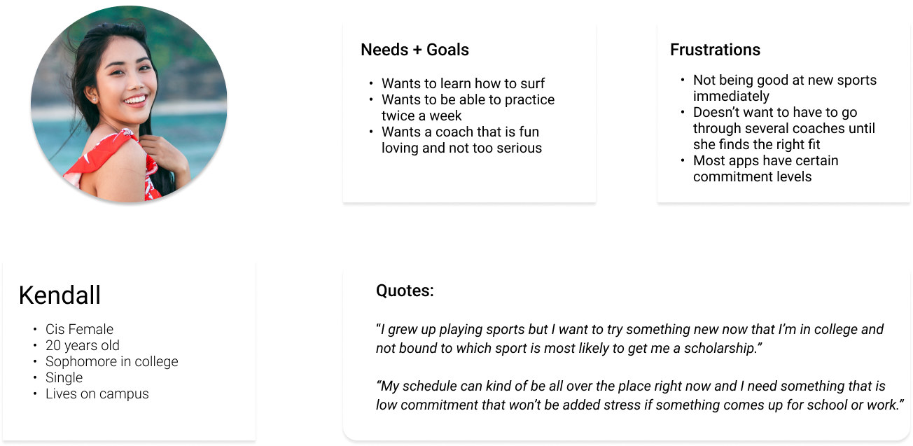
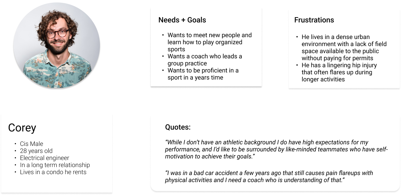
User Personas
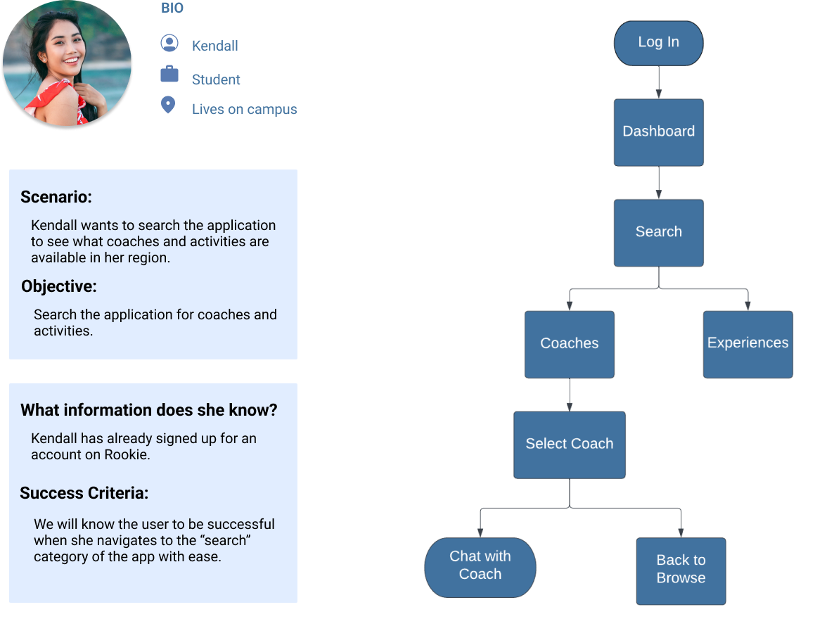
User Flows

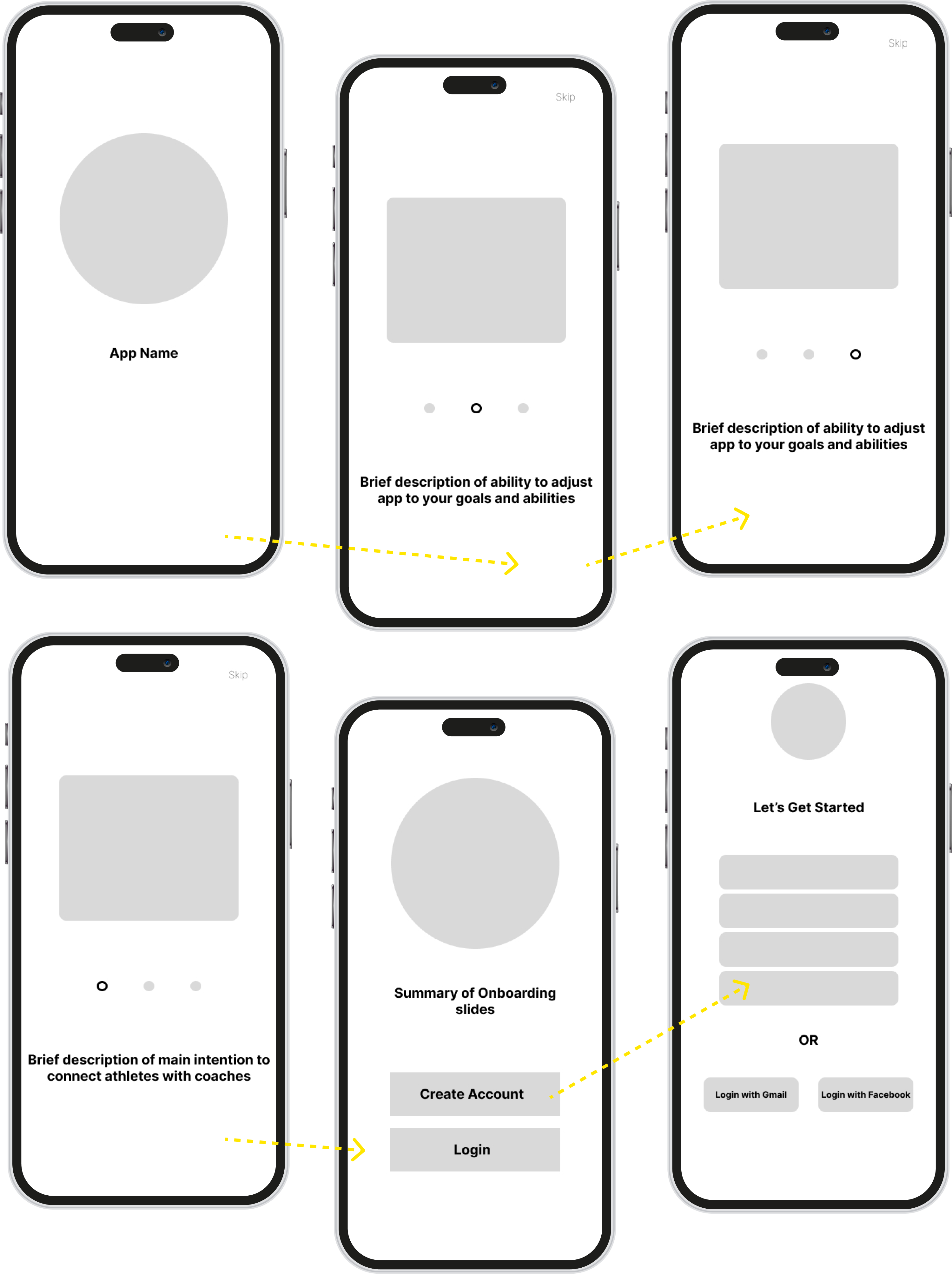
Mid Fidelity Wireframes
Usability Testing
- With the implementation of our mid-fidelity prototypes, it's time to introduce them to our users to guide future iterations.
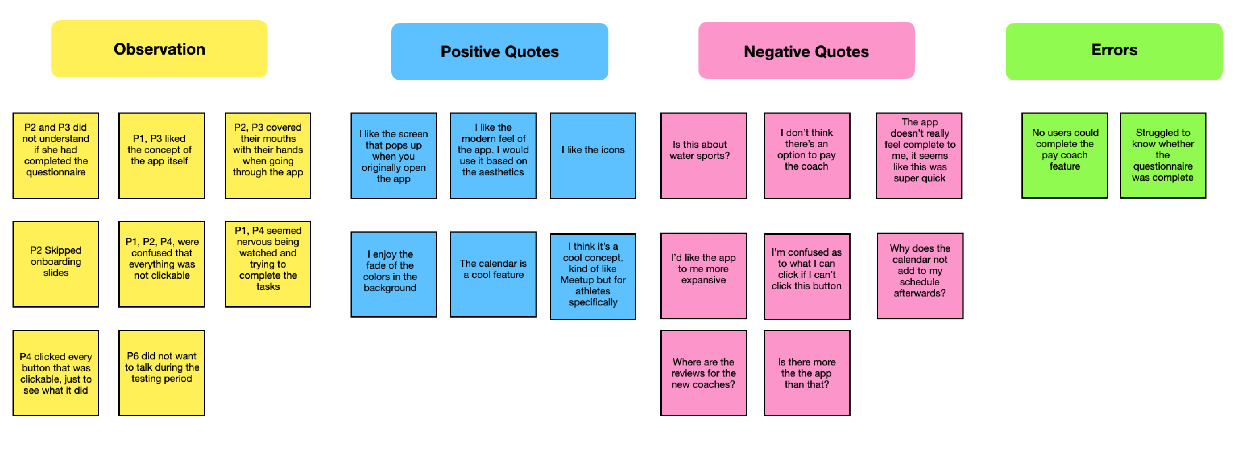
- The following results come from moderated remote interviews with a total of six users.
- I organized my findings using the affinity mapping technique. Using this method I am able to keep thoughts, errors, observations, and negative quotes organized and categorized accordingly.
Design Decisions
- During usability testing, a new problem was identified. Users are unsure where to go for scheduling and how to get to their schedule efficiently. My hypothesis is that if we create a schedule option on our dashboard page, users will be able to efficiently navigate to the schedule and deal with less frustration and thinking.Our hypothesis was validated by implementing this proposed solution and running more usability tests with the goal of users simply navigating successfully to the schedule.
- Other improvements come in the form of polishing the onboarding flow once more and letting users have a better idea of where they are in the process and if they can skip ahead, or go back to where they were.
High Fidelity Wireframes
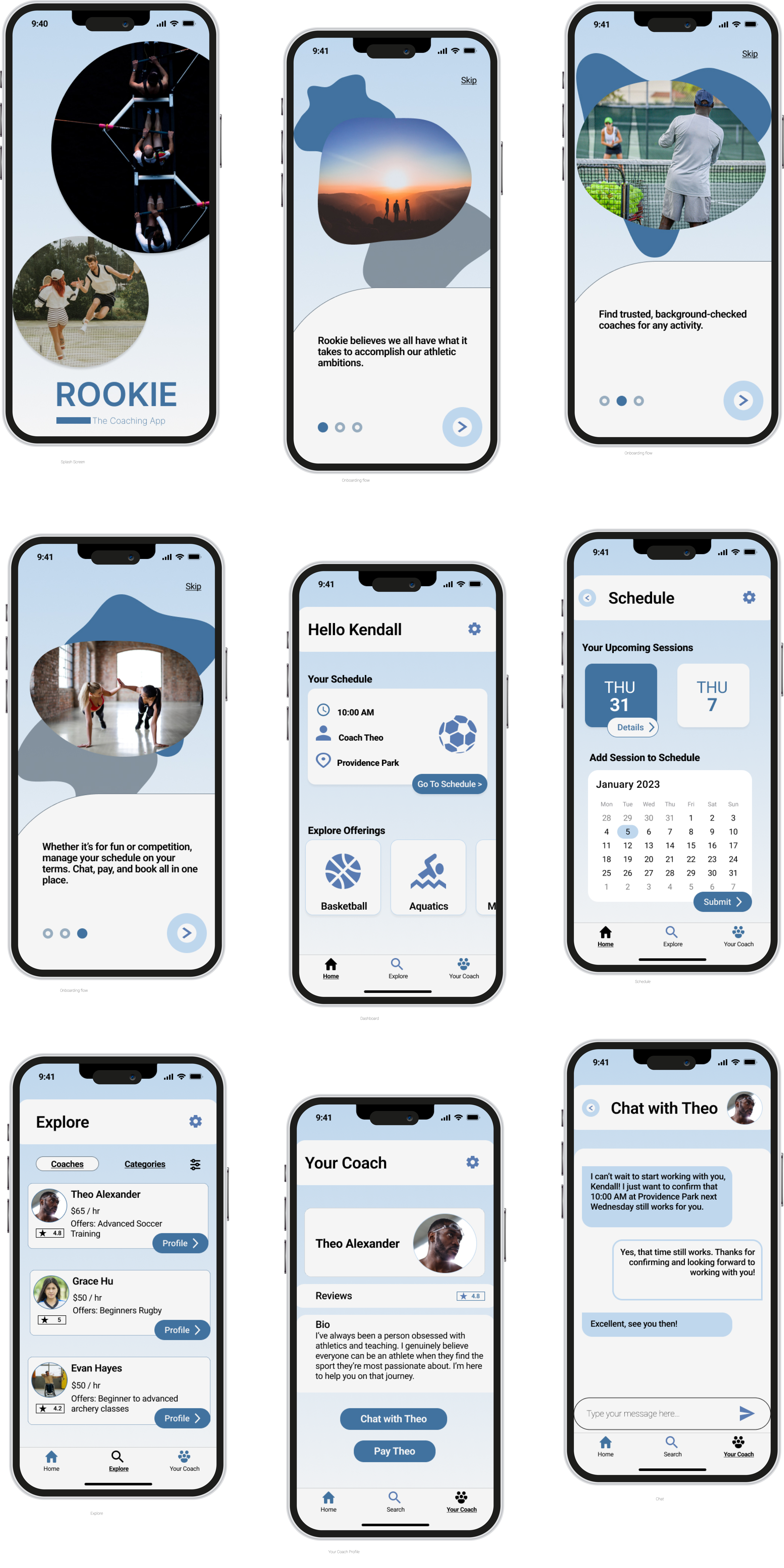
The users wants and needs in action.
Using the feedback received from my usability testing, I created a high fidelity prototype to reflect the wants and needs users expressed throughout the design process. The final layout of my application is based off of Gestalt principles and Material Design.
